
My Creative Process(es)
A cinematic movie trailer (for a book), a superhero logo, and a guitar build. My creative process(es).

Hey, Friends! This week, I take you behind the scenes of my creative process in three projects: a movie trailer, a logo design, and a guitar build. Let’s get into it!
Coming to Theater Near You (I Wish)
Last week, I wrote about how Mattel is using the Sora video engine to prototype toys. This week, I did a deep dive into AI video generation. I set a goal to create a cinematic movie trailer for my upcoming novella release, Windsor Greetings, which will be available in paperback and on Kindle on November 4th.
Before I talk about how I did it, let’s jump to the conclusion and take a look at the final product:
Not bad, right? So how did I do it?
I wanted to have persistent characters across scenes, so I figured having reference images for the model to base the videos on would be helpful. I’d previously designed the cover of my book, featuring two characters from the story, Alex and Tyler, using a vector illustration style. So I had an idea of what I wanted them to look like. However, stylistically, I needed them to be photorealistic.
Here’s my prompt sequence to build the references:
I pulled the illustration of Alex from Photoshop and fed it into Google Gemini, asking it to “make a photo-realistic version of this image.”
I then prompted Gemini to “show me his whole face (turn 90 degrees).”
Now that I had the character, I had to set the scene, so I asked Gemini to: “Make a photo of this guy in the backseat of an Uber at night with it snowing outside, looking longingly out the window.”
Here are the results:
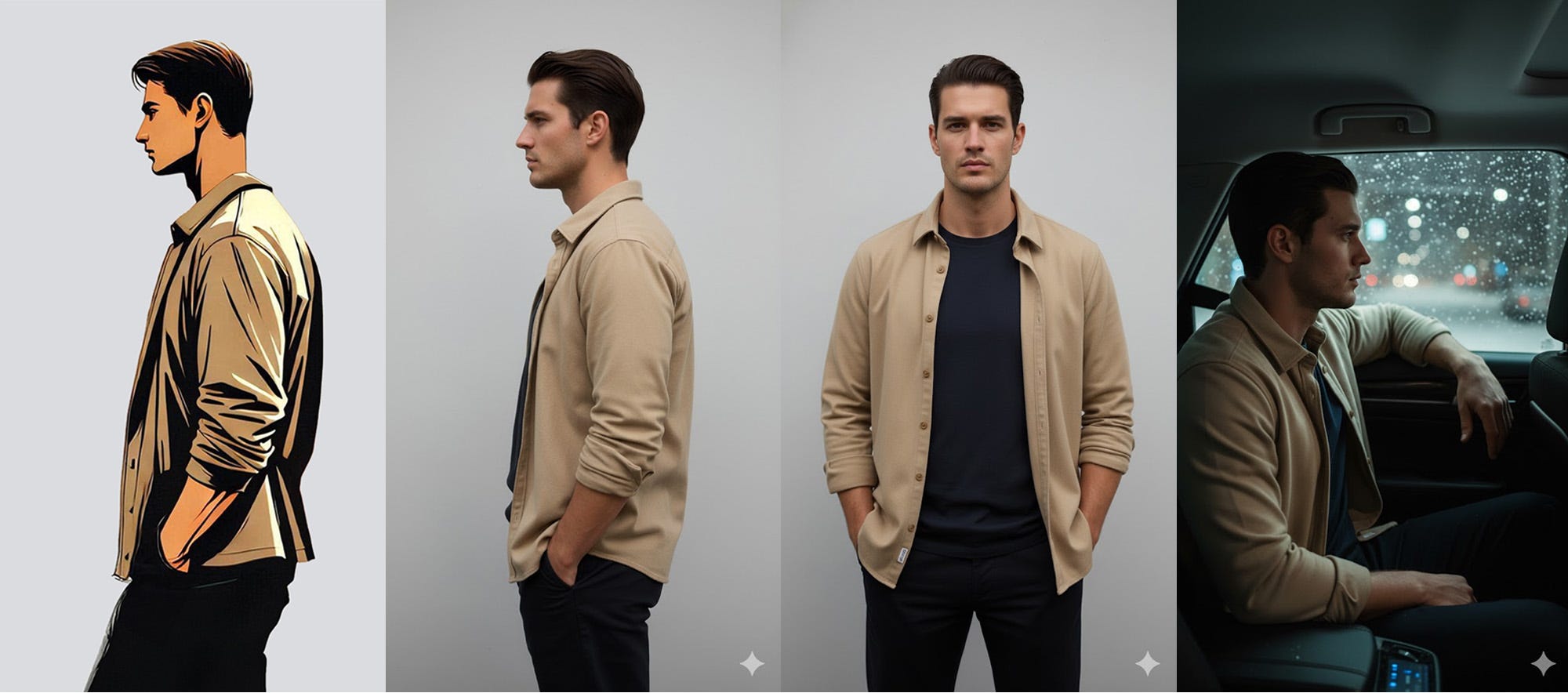
Once I had the character and scene reference, I fed the image into Sora along with the prompt:
A man sits thoughtfully in a car, gazing out a window as snow falls, with blurred city lights in the background.
But Sora alerted me that I was in violation of their content policy as they “do not support uploads of images containing photorealistic people.”
Grok’s Imagine does, though! I found that its initial results weren’t precisely what I was looking for. Alex was a little too fidgety, and the camera was a bit shaky. Fortunately, Grok lets you customize the video further. I refined it with the prompt:
The man sits looking out the window to his left as the car drives.
I’m not sure how much the tailored prompt helped compared to just running the prompt a second time, but my takeaway was that if you don’t get what you want initially, customize the prompt with more detail and try again.
Here’s the full clip:
You’ll notice the video has music in the background that didn’t make it to the final cut. I found that the audio, especially speech, is not quite ready for primetime. Knowing this, I factored that into my vision for the final product.
I basically repeated this process for every clip.
Gemini did an amazing job helping me visualize the characters in my head. Half the time, it got it in one shot. Other times, I had to wrestle the image into existence. Take Alex’s father, Henry, for example:
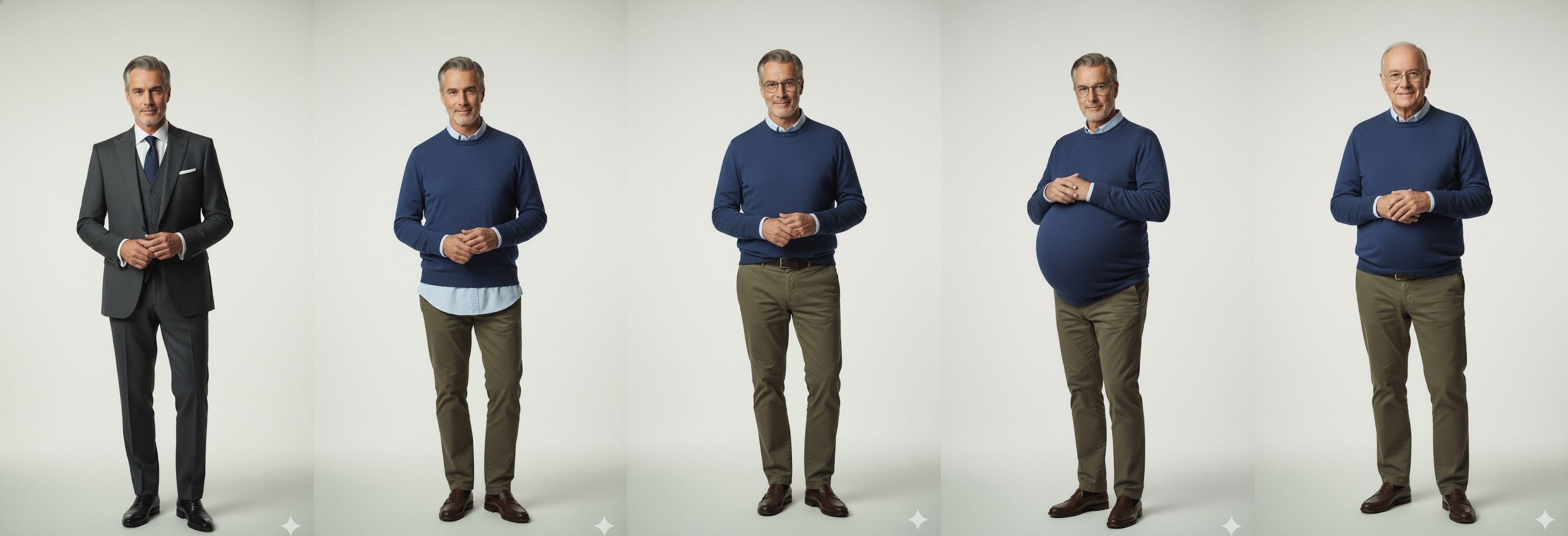
After a brief pregnancy, I eventually got there.
Once I had four or five clips, I recreated the movie trailer tag image in Adobe Illustrator, and searched for cinematic trailer music on Motion Array, which I have a premium account for.
I then sloppily wrote the narrator’s script and asked ChatGPT to help refine it for a cinematic movie trailer. I ended up going back and forth like nine times, using it more as a thinking partner than to write for me.
I experimented with a version of the script that was dialogue from Alex’s perspective, but felt it didn’t match the footage well and scrapped it entirely.
With the script in hand, I brought it to ElevenLabs for narration. I used the voice model called “Chuck Fresh - Movie Trailer.” I fiddled with the speed, stability, and style exaggeration until it yielded something I felt was suitable.
With most of the assets complete, I threw it all in Adobe Premiere and cut it together. Along the way, I realized I was short a few scenes, and prompted them to fill the gaps. To create a greater sense of cohesion, I color-graded the clips and added a subtle scanline overlay effect.
In the end, this task took me 3-5 hours, and I was able to complete it from the comfort of my own keyboard. Had I produced this same footage using traditional methods, it would have taken me weeks and likely cost me tens of thousands of dollars.
Takeaway: I’m still processing what this means for the future of the film industry, but one thing is certain: if you have an idea for a video, there’s almost no excuse for not bringing it to life.
A Look Inside My Sketchbook
I’ll be honest, this feels a bit like speaking publicly in my underwear. I’m pretty self-conscious about my handwriting and my ability (or lack thereof) to sketch, but in my forty years or so, I’ve learned that growth happens on just the other side of your comfort zone.
So here I am—metaphorically pantsless—baring it all.
Maybe a little context first:
My son wants to be a superhero for Halloween, but not a regular off-the-shelf superhero. He wants to be “Jumping’ Jack Flash,” and despite that being the title of a famous Rolling Stones song, that didn’t offer much in the way of art direction for costume design.
Always wanting to promote creativity in my kids, I asked my son to draw a picture of what he wanted his costume to look like. Here’s what he came up with:
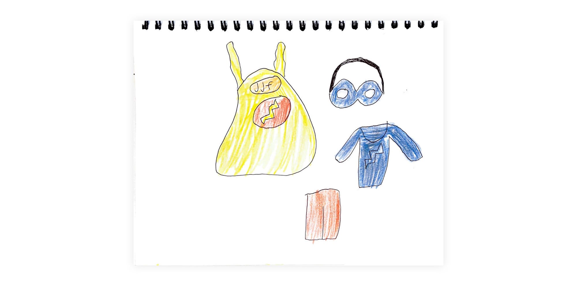
Not too bad for a six-year-old.
Whenever I solicit input from a client or collaborator (even when they’re my own children), my attempts are not to reproduce what they’ve given me but “better.” Instead, I try to infer what the spirit of the design is that they have in mind and present it to them in a crystallized form.
What I took from his sketch is that he wanted to incorporate both the initials of his character and a flashy lightning bolt into the design, but trying to cram both “JJF” and a symbol into a single superhero logo felt like it would be too busy. From his art direction, I was able to pull the idea of combining a single letter “J” and bolt into one logo, though, and that’s what I set out to explore in the pages of my sketchbook:
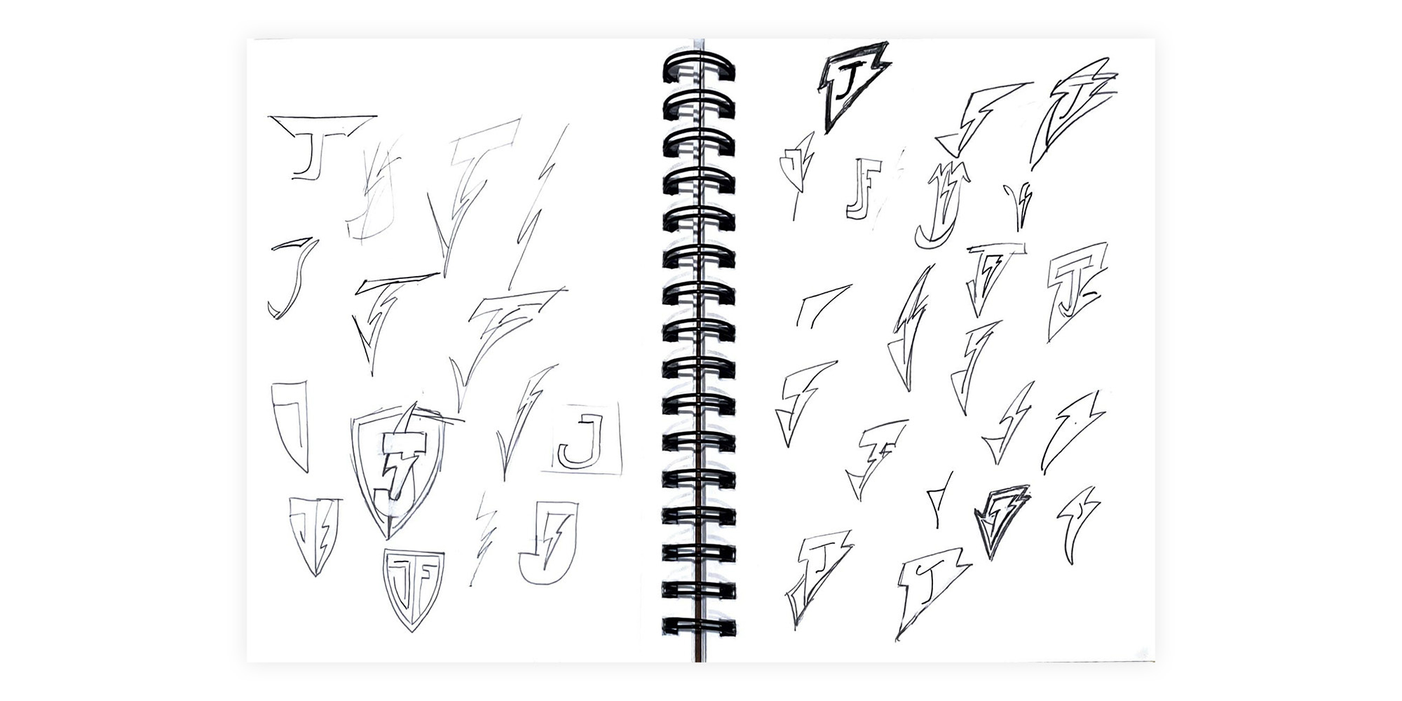
You’ll immediately notice how crude and undisciplined my pencil strokes are. I wish the pages of my notebooks looked like Nathanial Roy’s (damn works of art unto themselves), but they just don’t.
They do serve a purpose, though.
Using pencil on paper allowed me to rapidly prototype through thirty-plus different concepts for the logo. Intuitively, I knew that the mostly vertical letter “J/j” with its curly terminal end/descender was going to be difficult to combine with the diagonal and angular shape of a lightning bolt. The crossbar and tittle (the lowercase letter’s dot) weren’t doing me any favors either.
There were several concepts I tried to execute in my pages:
Make a “J” that looks like a lightning bolt: Complete failure
Intertwine a lightning bolt with a letter “J”: Meh
Incorporate a “J” and a bolt into a badge of sorts: Almost, but no
Put a letter “J” in a bolt: Maybe… but no.
Put a bolt in a letter “J”: Just didn’t fit
Make a lightning bolt that looks like a letter “J”: Possibly
At the time, these pages were meant for an audience of one—me. I had no intention of showing this to anyone. I simply wanted to explore what could be and move directionally towards the final version. Ultimately, I felt like the lightning bolt as a J was the concept that showed the most promise.
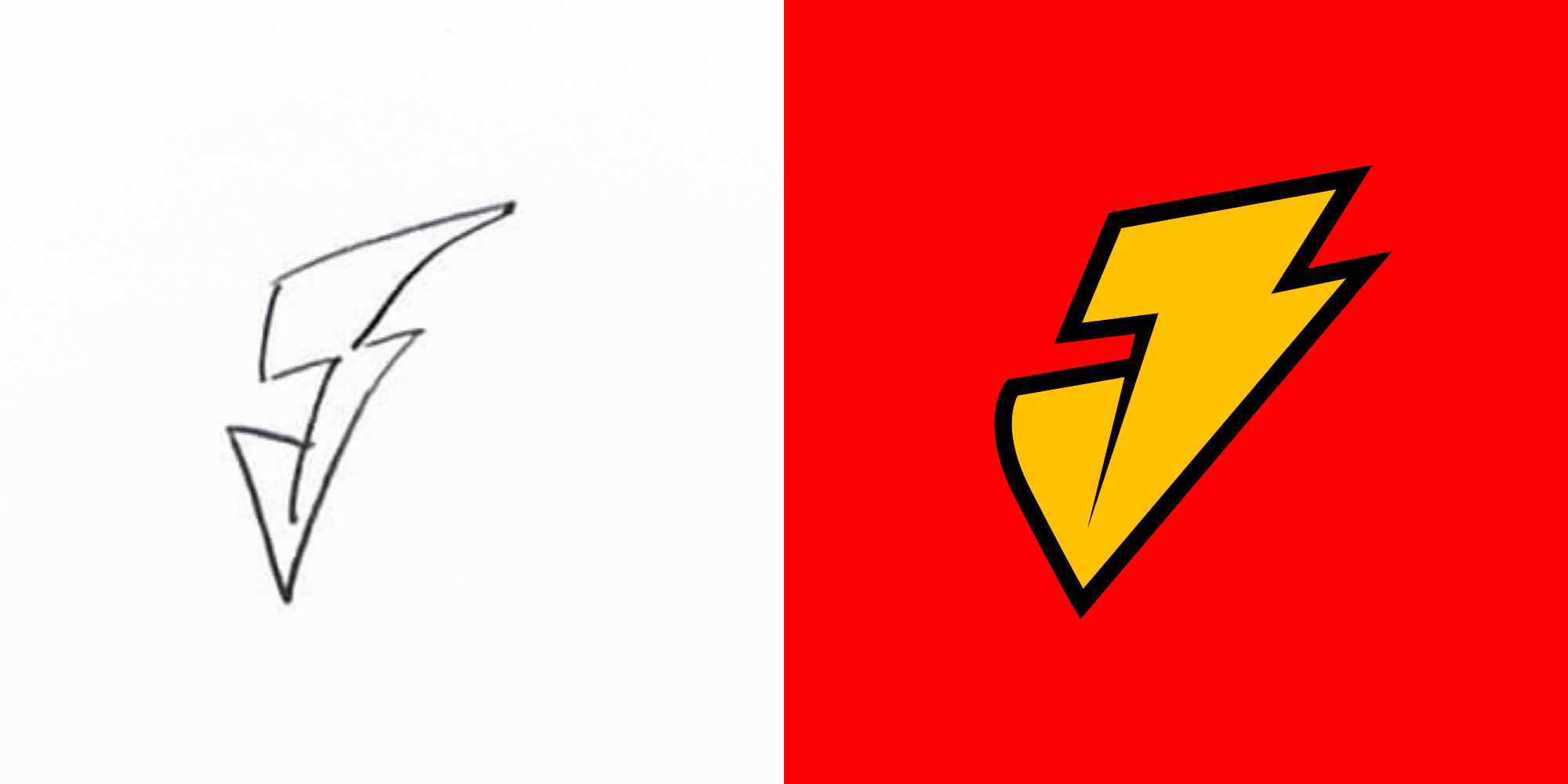
From there, I built the shape in Adobe Illustrator with the pen tool and then experimented with different variations on the initial sketch:
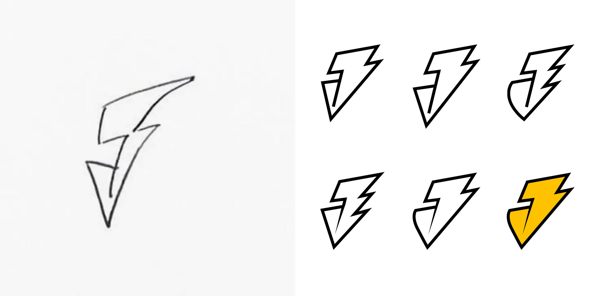
In short, I liked the initial concept, but I felt it needed some refinement. Incorporating a thicker stroke, a curved terminal end, a pointed separator line, and a touch of color really helped this come to life.
Below, you can clearly see a connection between where I started (after an hour of sketching) and where I ended up.
Again, I wish the pages of my sketchbook themselves looked better, but that’s not really what they’re for. Notebooks and sketchbooks, at least for me, are tools I use to be productive, reflect, and explore what’s possible.
Takeaway: If you worry about sullying the pages of a fresh notebook, try to remember that’s what they’re for.
Guitar Updates
I’m slowly chipping away at my next guitar project. Here’s what I accomplished this week:
I laser-engraved the lightning bolt sound holes
I cut out the top
I cut the fret slots into the padauk fretboard
I installed white fret markers on the edge of the fretboard
Take a look at my workbench below:


Next, I plan to finish the walls of my guitar body, affix the top to it, and rout the neck pocket. I’m also aiming to engrave my logo into the headstock and flush cut the body to the top.
I’d love to work on this all day, but I’ll settle for 15 minutes here and there over nothing.
What you might not be able to tell just by looking at the pictures is that I’ve already made more errors on this project than I can count. I’m not seeking perfection, though, so I’m happy to live with them. I like to think of each one as evidence of its handmadeness and not a flaw.
Perhaps I’m deluding myself, but it makes me happy.
Takeaway: You’re likely your worst critic. Share your work, even if you hate it.
One More Thing
It really helps when you like, comment, restack, or share my work with others. Please consider helping this newsletter grow by doing one of the above.
See you next week!
-Mike
Hey Mike, creativity is off the charts! Enjoying the development the novella and use of AI. Cant wait until the novella is ready for distribution (gonna need a signed copy, right?) Will we see episodes on you tube or even Netlflix? And the guitar project continues to hold huge interest from my side. Do you have a portfolio of your creations? Sure you’ll get Jumpin’ Jack ready for Halloween? Chat soon.
It's funny—I often wish my notebooks looked like others', too!