Book Cover Design: A Case Study
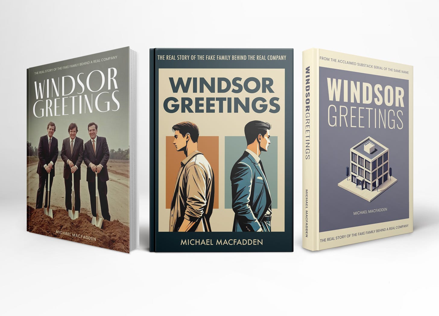
A book designer critiqued three book covers I designed.
In this post, I’ve collaborated with the talented Nathaniel Roy, to design a cover for my upcoming novela: Windsor Greetings. Take a look behind the curtains at my messy design process.
A little while back I came across Nathaniel Roy’s viral post I Can Tell Your Book Was Self-Published. As a digital graphic design teacher who works with novice graphic designers, I felt like he was speaking directly to me: excessively dark drop shadows, the “papyrus” font, poor typesetting, and low resolution imagery—all telltale signs of only-kind-of-knowing how to use Photoshop.
After reading his piece, I immediately subscribed to his newsletter (you should too), and said to myself, “You should try to work with him some day.” Fortunately, I’d been working on a piece of fiction that I intend to publish as a serial here on my newsletter, and then later as a book on Amazon.
I just needed to muster up the courage to see if he’d work with me.
After working on my story for the better part of two and half months, I finally considered it done last week, and figured now was as good a time as any to ask. The worst he could say was no, but to my delight, he enthusiastically agreed to collaborate with me.
Nathaniel and I are both sharing this with our respective readers. Read his perspective on the critique in his newsletter here!
What follows are three covers I designed for my book each followed by Nathaniel’s pre and post summary read critiques. At the end, I join back in to share the revisions I made based on his thoughts.
Summary
For context, I’ve provided a summary of the story below:
Windsor Greetings follows the Windsor family as they grapple with deep-seated tensions, personal betrayals, and the challenge of transforming their artisanal greeting card company in a rapidly evolving industry. Alex, the ambitious youngest son, returns to the family fold with a vision to transform the business, clashing with his brother Tyler, whose questionable decisions have worsened the company's decline. A sudden family tragedy shifts the balance of power, forcing the family to reckon with their shared history and the future of their legacy. Set against the backdrop of a changing industry, the story weaves themes of innovation, loyalty, and the complexities of familial bonds.
Cover 1
First Impression
The image on this cover gives me the impression of satire or comedy. Like a history of the Bluth company from Arrested Development. Maybe it’s the vintage, greenish color palette and the slightly goofy affect of these men in suits with wavy hair. I’m into it!
Critique
Imagery:
If you look closely, particularly at the fingers and eyes of these figures, you can tell this image was AI-generated. I am generally against the use of AI-generated imagery in book covers for its ethical implications, but I won’t hold that against Michael here. However, I think if you’re going to use it, it’s got to work at the detailed level. If dead eyes and mangled fingers are meant to be part of this cover, I think they need to look more intentional.
Typography:
The title typography does a solid job of matching the vintage aesthetic of the image. However if the book is satirical or comical—I don’t know yet—I might explore using a more contemporary typeface, or even handlettering, to contrast with the image and better indicate this editorial position.
“Windsor” looks slightly larger here, probably to even out the line lengths of the title. Most probably won’t notice consciously, but I think this gives a slightly unbalanced feeling. I would probably make “Windsor” the same size as “Greetings,” increasing the leading a bit, and possibly scale the entire title down a touch so that it occupies a similar total area.
I think the author title here feels a little bit like an afterthought. Small can be okay, but I think more can be done here to integrate the author name. Maybe size, maybe font, maybe somehow incorporating the words into the dirt somehow?
To get really nit picky for a second: the kerning between the “P” and “A” in “company” in the subtitle is too big in comparison to the rest of the letters. When typesetting, special attention is often needed for kerning those letter A’s!
Thoughts After Reading the Book Summary
The summary provided by Michael reads as more earnest than my initial interpretation of this cover. That’s not to say that mine is the only, or best reading of it! I wonder if the stiffness of the artificial intelligence, as well as the creepy eyes and mangled fingers, lent a more sardonic vibe to the cover than intended. Michael also confirmed that the story takes place in the present day, which feels a little at odds with the vibe of the image. I think knowing this, I would change the title typeface to be more contemporary looking in order to achieve better contrast with the image.
Cover 2
First Impression
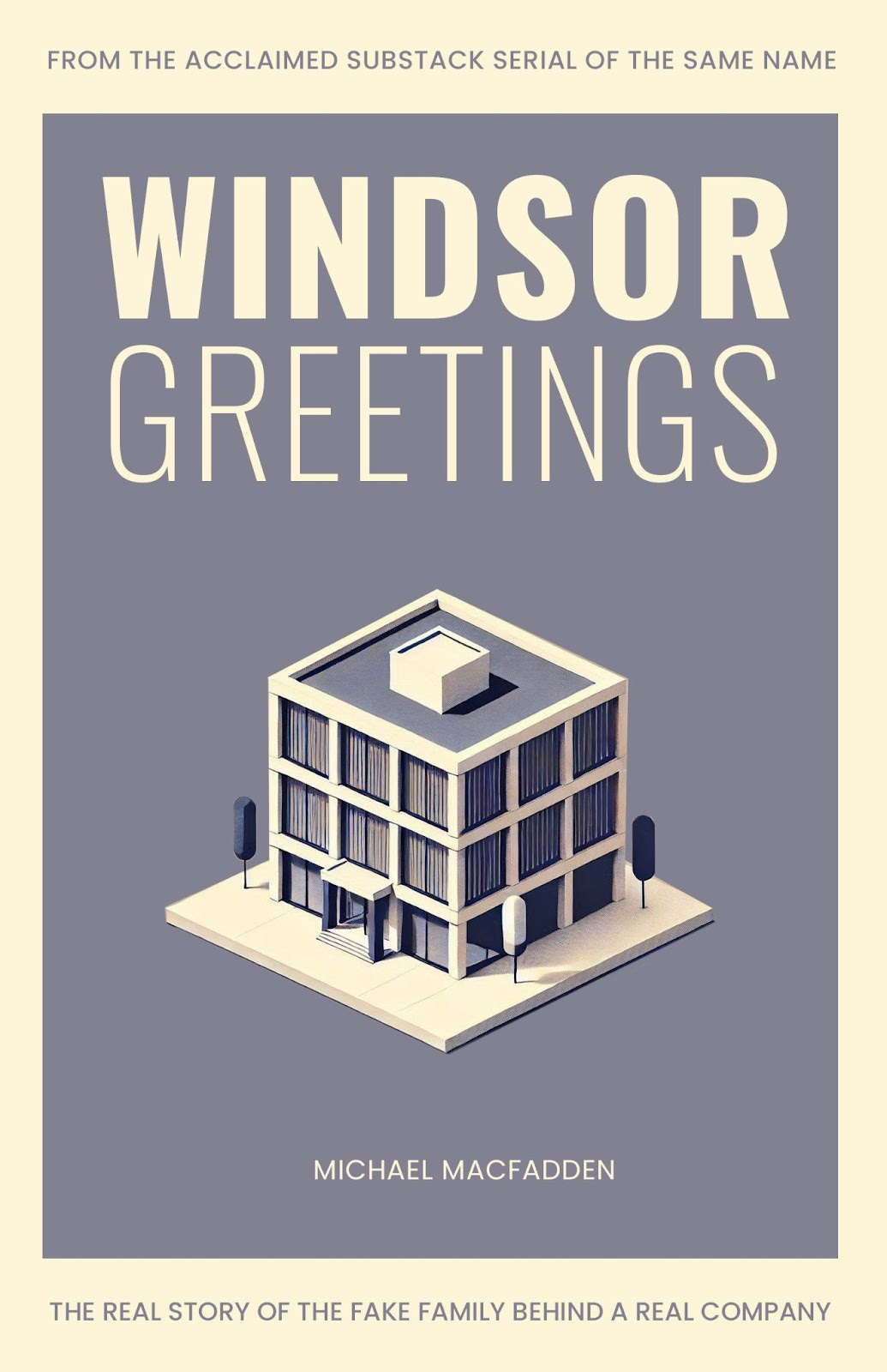
I get slight Severance vibes from this cover! I think this is due to the color palette, modern typography, emphasis on a geometric building that almost looks like a miniature, and the illustration style. There’s a mid-century cleanliness here that I like and wonder how it represents the story. Is the language sparse and direct? Or should there be something present in the cover that subverts this cleanliness?
Critique
Imagery:
Looking at the blinds, it appears that this image is again AI-generated, however I think it looks less blatantly so.
I’m intrigued by the main image—it’s small for a building. A little awkward, stunted. Is this intentional, or a byproduct of inexact prompting? It gives the impression of being a toy or miniature. Does this play into themes of power and control in the book? If so, a hand breaking the border plane might help drive this theme home as well as introduce some dynamism to what is otherwise a fairly static, but still strong, composition.
Typography:
“Windsor” looks larger again here, but this time it works for me because it is a different weight than Greetings and therefore enough contrast as to not cause visual friction.
Again, the author name is small. I think it works better here because there is better legibility than the previous cover, however I still might want to see it increase in size in order to provide a sense of hierarchy between the author name, the subtitle, and tagline.
Thoughts After Reading the Book Summary
After reading the summary, I think this cover works pretty well. But because the family owns a greeting card company, I would love to see that incorporated somehow, maybe into the building, in a way that tailors the image more to the story and looks a little less generic.
Cover 3
First Impression
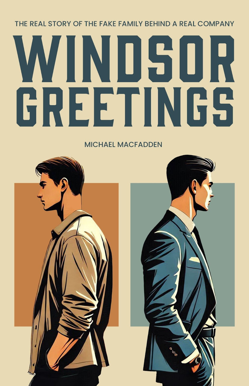
Cain and Abel. East of Eden. Brothers in disagreement, choosing different life paths. More vintage vibes here, thanks to the title typeface.
Critique
Imagery:
I like the composition and colors here.
This isn’t right or wrong, but generally, full-ish figure illustrations like this are often associated with the romance genre. We may dislike tropes, and tropes may change, but they are something we need to take into account when designing a book cover that we hope sells our book.
The illustration style reminds me a bit of anime. Maybe this is because I am dumb. But I am willing to bet it might also remind a general audience of anime! Is this intentional? Is it desired? It’s not inherently a bad thing.
I’m not sure if this illustration is AI-generated, but I’m willing to bet it is based on the other two. This does a better job of hiding it, though there are a few fixable, detailed flaws: there’s a chunk missing from the nose on the figure on the right, and the figure on the left’s head is a touch see through and the sharp edge of brown plane behind him is visible.
Typography:
My critique of the typography here is largely the same as the others:
I’d standardize the size and slightly increase the leading of the two words in the title
Adjust the kerning of the subtitle
The size/placement of the author name doesn’t work for me. This one really feels like you weren’t sure where to put the author name! To get bigger, it would likely need to move or necessitate an adjustment to the composition, but right now it feels squeezed in as an afterthought.
Thoughts After Reading the Book Summary
While I love—and have used—the title typeface here, Gin, I think that knowing the story is contemporary, I would tweak the font. The illustration here feels probably the most contemporary of all of the options and I think there might be a typeface that better matches this aspect of the book.
This cover most clearly communicates the conflict between the two brothers in the story.
Overall thoughts:
Though I would be able to tell these book covers were self-published, they are better than a lot of self-published fare.
Strengths: I think these covers have strength in their overall compositions, color palettes, and thoughtfulness behind their font choices.
Weaknesses: I think they have some weakness in their use of obviously AI-generated imagery, some nitpicky typesetting details like leading and kerning, and a general lack of cohesion when it comes to the author name on each cover.
I think covers 2 and 3 are the most successful. Cover 1 has an interesting energy, but ultimately looks the most “vintage” of the three and also is the most AI-generated, which I think is distracting from a book cover’s purpose to represent and sell the book.
Me Again
First of all, I must express my most sincere gratitude to Nathaniel. His keen eye and professionalism is very much appreciated. I pretty much agree with everything he said, with the exception of, in Cover 3, it wasn’t an AI hallucination that caused the weirdness, it was sloppy Photoshopping (of AI assets) on my part.
With his art direction in hand, I re-opened Photoshop to take another crack at Cover 3 (my personal favorite). Below you will find it in what I believe to be a much improved state.
Thanks again Nathaniel!
Want a critique of your own? Fill out this form.
For a fee of $100, Nathaniel will provide a detailed critique featuring his first impression of your cover, analysis of what works and doesn't work, and one follow-up Q&A email.
See you soon
If you’re reading this online, it would mean the world to me if you subscribed to my newsletter. It’s free, and always about creativity and innovation. If you’re already subscribed, please share this with a friend.
See you on Tuesday for two quick hits of inspiration, and again on Friday for my weekly roundup of creative takeaways.
-Mike


I like the first cover, despite misleading time-wise... something still is more iconic and attention grabbing about these three goofy looking suits, and at least the more humanness (I couldn't tell it was AI at first) about it might make it the most likely cover I'd pick up.
I like your modifications on the last cover, and having read your description of the story the Hardy Boys theme feels right. Nice work!